

Redistricting plans in 50 states, graded (correctly)
...but first, we have to kill the proportionality myth.

I'm pleased to announce that the Electoral Innovation Lab, in collaboration with the Princeton Gerrymandering Project, has compiled a complete set of grades (also archived at the Harvard Dataverse) for redistricting plans, both congressional and legislative. This represents our best effort at coming up with a uniform, rigorous, and actionable approach to evaluating redistricting processes in every state.
To understand what we've done, first it's important to dispel the single most common misconception about redistricting: the myth of proportionality.
Most non-proportional results aren't gerrymanders
Over and over, I encounter statements like this: "Massachusetts votes 60% Democratic, yet nine out of nine of its representatives are Democrats. Surely that's a gerrymander."
Actually, no, it's not.
The simple reason is that no district-based system guarantees proportional representation. And it's not because of purposeful manipulation by bad actors. Even a neutral, non-partisan process will lead to a non-linear translation of votes into seats.
In the example of Massachusetts, Moon Duchin and collaborators demonstrated in 2019 that Republicans are distributed so evenly around that state that it was mathematically impossible to draw a majority-Republican district. This shows that distribution matters. To see how general this idea is, graphs can help.
Understanding the Math Behind District-Based Systems
First, let's think about single districts. Imagine that a political party gets 60% of the vote in a district. They therefore elect 100% of a member of Congress. Such a method is not unfair or gerrymandered. Rather, there is no other way to assign a single seat.
So the number of seats as a function of votes looks like this:
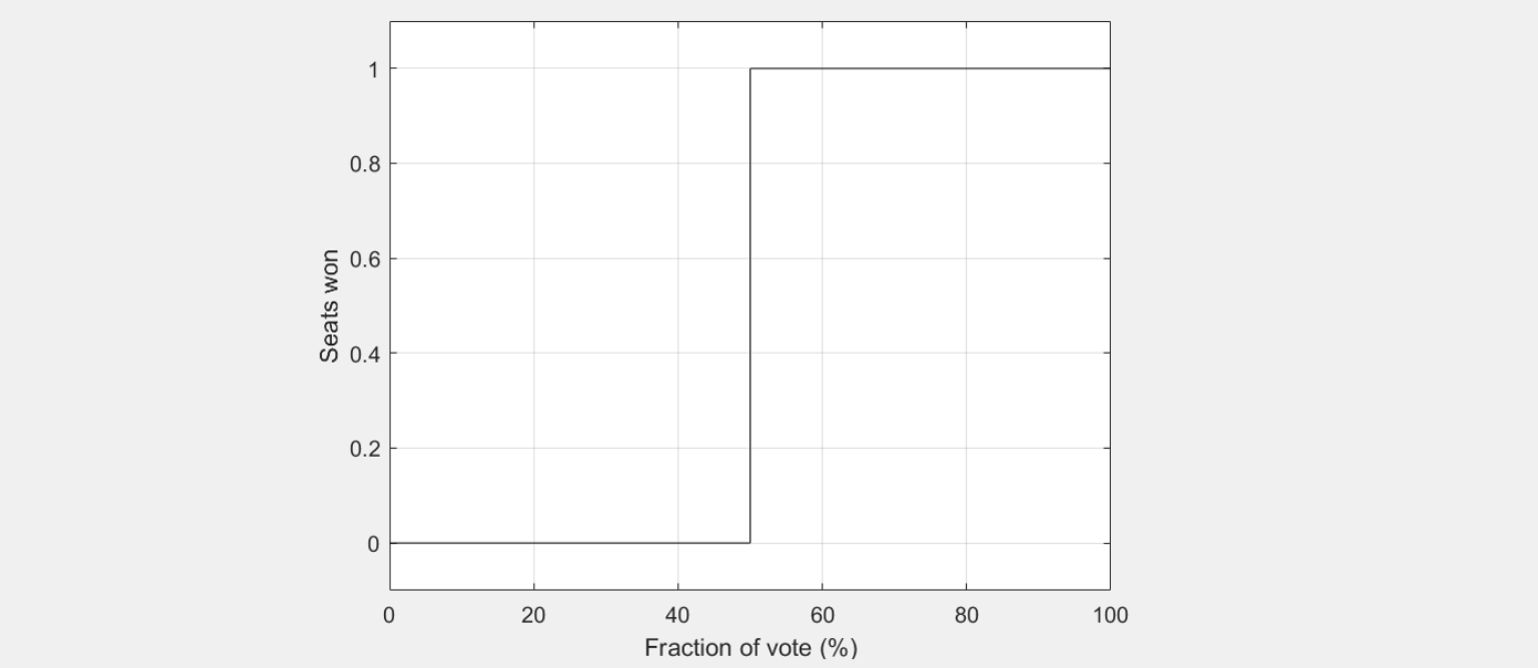
For obvious reasons, this is called a step function!
Now imagine a state with just two districts (for example, Idaho or New Hampshire). If one is a little above average for the state, the other has to be below average by the same amount. Now representation depends on statewide average vote like this:
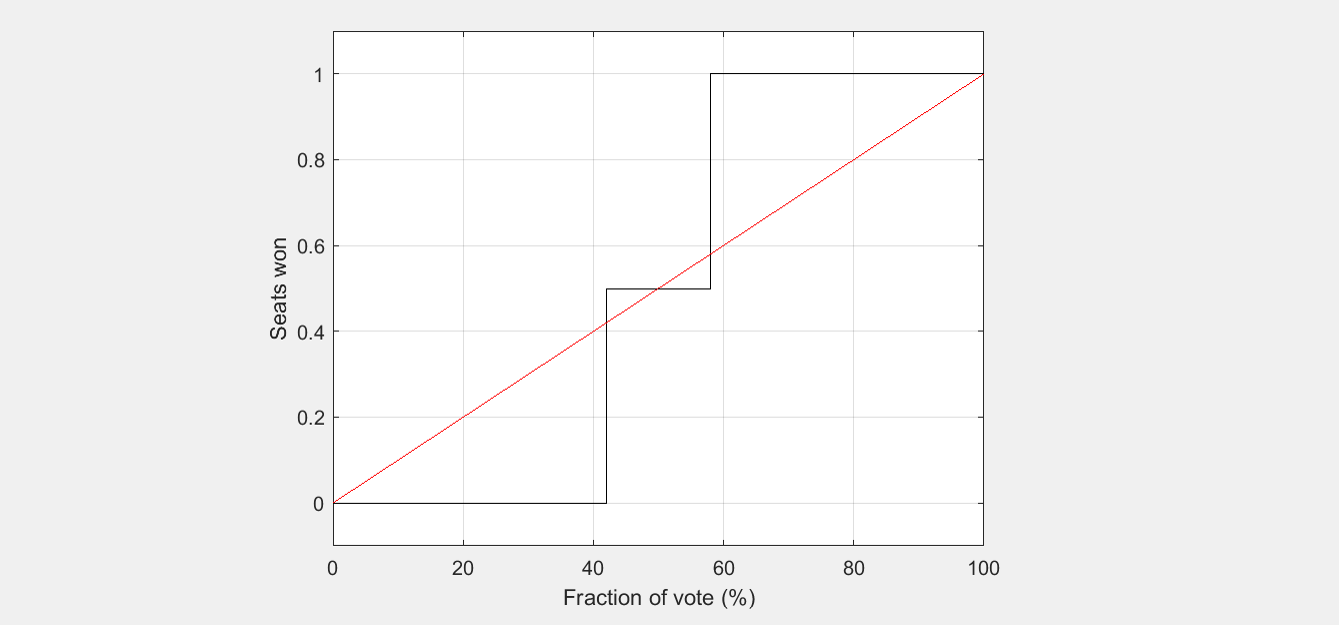
In this case, I have added a red diagonal line to show what proportionality would look like. But as you can see, whole ranges of vote (in this example, 0 to 42%, 58 to 100%) lead to both seats going to the same party.
However, this is not necessarily because of nefarious intent. In a 50-50 state, a 58% Republican, 42% Democratic district and a 58% Democratic, 42% Republican district don’t sound that crazy. This could happen just because of where people choose to live.
For example, Idaho is all the way to the right of the graph for Republicans, and has two representatives of the same party. That’s not because Idaho is gerrymandered. Idaho is just really Republican.
The S-Curve: Why multi-district systems create non-proportional results
To understand a larger state like North Carolina or Pennsylvania, we can keep going by adding more districts that are distributed around the statewide average vote. When we have lots of districts, the relationship between votes and seats typically looks like an S-shaped curve:
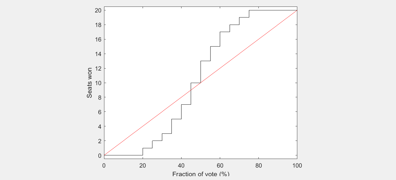
Oh dear…from a proportionality standpoint, this is not going well at all! But it is exactly what arises from a realistic, neutral process. Why is that?
The reason for the S-shape is that districts' voting tendencies fall on a bell-shaped curve. The number of seats you get as a function of the average vote is then the area under this curve, which is shaped like an S. (Many years ago, political scientists called one version of this curve the cube law, for reasons I will skip today.)
As it turns out, this is what neutral districting processes do - they make districts whose partisanship tends to follow a bell-shaped curve. That’s because districting has to follow lots of rules and has to represent cities, counties, communities, and racial groups. When all of those conditions are met, then partisanship is an incidental output of the system - and according to the laws of statistics, follows a bell-shaped curve. The exact shape of this curve depends on how variable districts are, and sometimes it is a little skewed, for reasons like geography.
However, the seats-votes curve can be distorted if the redistricting process places partisan advantage above other criteria - in other words, if a partisan gerrymander is committed.

Using math to identify a gerrymander
When a state has a seats-to-votes relationship that deviates from this S-shaped curve statistically, there has to have been some other reason. One possibility is that people live unevenly—for instance, Democrats living in cities and Republicans living in rural areas. In practice, that leads to only small discrepancies. Such effects are much smaller than those of purposeful gerrymandering.
The Princeton Gerrymandering Project has developed ways of incorporating this kind of statistical thinking into its grading system. The Gerrymandering Project calculates what would be a fair range of seats based on statewide vote. It also does hundreds of thousands of simulations in each state that start from the actual voting patterns, thus estimating what a neutral process would produce, given a state’s particular political geography.
All of this gets used as part of a comprehensive grading rubric. The resulting grading system can be applied to any state legislature or congressional delegation. Grades range from A to F. Roughly speaking, A and B are good grades, while C, D, and F are bad grades. Just like real life, but without grade inflation.

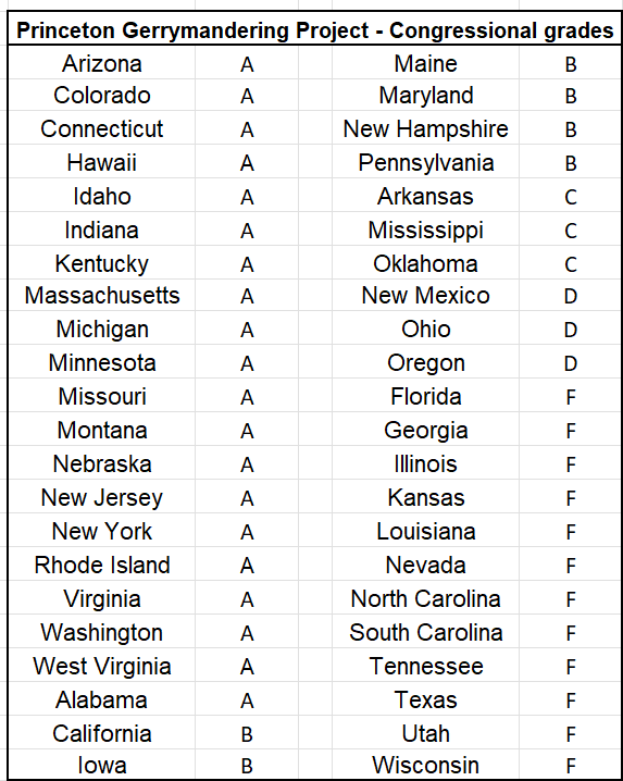
The Princeton Gerrymandering Project - Congressional Report Card
At last, here are current grades for all states with more than one House district.
We’ve paid the most attention to the 2021 cycle of redistricting. But these standards are timeless: the S-curve-based approach can identify gerrymanders of the past as well.
Here is a timeline of gerrymanders by decade. This bar graph shows the number of states where one party controlled Congressional redistricting, and gained two or more “excess seats” as a result, which almost always gets an “F”.
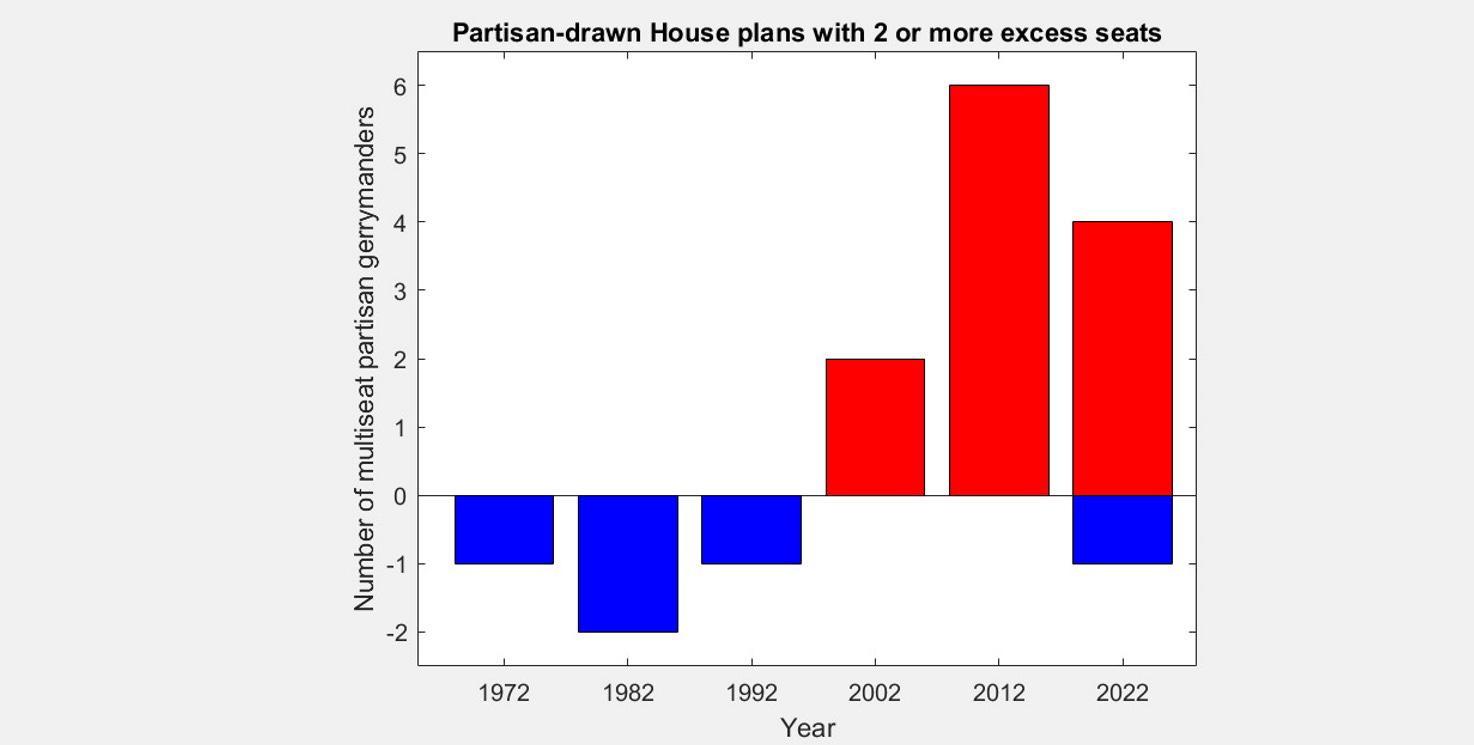
This was the basis for last week’s list of Top 10 Gerrymanders.
The power of independent citizen redistricting
That report card (and another one, for legislative maps) allowed us to inspect each state. We could then do something important from a policy standpoint: we could evaluate which redistricting systems led to the fairest outcomes.
Working at the Electoral Innovation Lab, Zachariah Sippy did something heroic: he analyzed the redistricting rules in all 50 states. Every state's rules are slightly different. We then noticed a very interesting pattern.
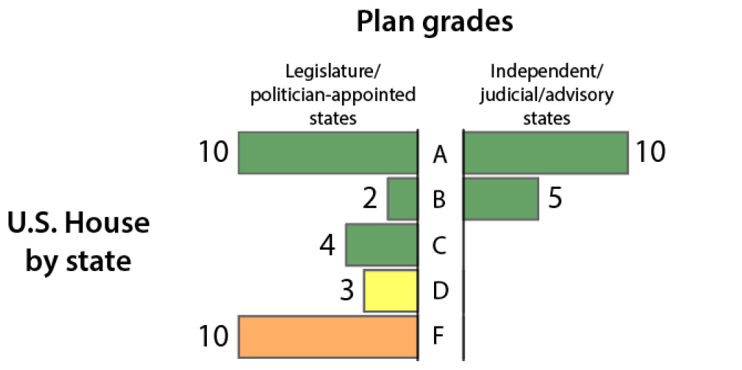
This histogram shows the grades that arise from partisan mechanisms on the one hand (legislatures, politician-appointed commissions), and nonpartisan mechanisms (independent citizen commissions, courts, advisory commissions) on the other hand. The results are quite different.
Basically, anytime an independent commission or a court is in charge of drawing lines, then the PGP grading rubric gave it a grade of A or B. In no case was the grade C, D, or F.
On the other hand, partisan processes produced more variable grades. With disturbing frequency, the grade was a D or F. Those are instances where the number of seats deviated strongly from neutral expectations.
From this systematic comparison across every state, we learned that there is a very particular way that districting can be fair: take the power away from legislators. Whether by commission or court, application of rules and principles by people who have no direct stake in the game leads to an outcome that resembles a neutral process.
The Competition Factor
Another interesting feature is competition. We see very different patterns of levels of partisan fairness depending on the rule for redistricting. The amount of competition is also quite different.
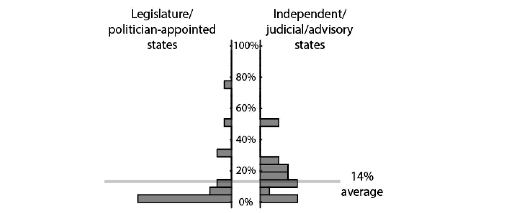
The fraction of competitive districts—defined as races that we estimate to be within seven points or less—is much lower in politically drawn maps than in maps drawn by commissions and courts.
The effect is even more apparent for legislative maps.
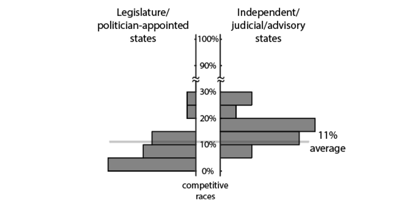
This is perhaps not surprising. Legislators want to reduce risk for themselves individually. They can reduce risk for their opponents as well, and can even sometimes get a bipartisan vote for their plan. That’s called a bipartisan gerrymander. And independent commissions and courts don’t do it.
The Path Forward
In conclusion, despite the controversies we've been seeing, there is a clear formula for how to get better districting. In about half the states, citizens have the ability to amend the constitution and form an independent redistricting commission. In some states like Illinois, extreme gerrymanders can be prevented in this way.
Such a route is not available in states like Texas, where no laws govern congressional redistricting whatsoever—truly, Texas is the Wild West. The only way Texas will ever get better districting is through federal law. Until then, the only justice is rough justice - which is why California is attempting to balance the offense with an equally-sized counteroffense.
Support the Electoral Innovation Lab!
If you liked this analysis, be aware that it was made possible by both the Princeton Gerrymandering Project and the efforts of the Electoral Innovation Lab. The Electoral Innovation Lab is a nonprofit, independent organization. It needs your support!
Acknowledgements: This work built on the efforts of the Princeton Gerrymandering Project, in particular Hannah Wheelen, Ari Goldbloom-Helzner, Ethan Arsht, and Drew Curran; and the Electoral Innovation Lab’s Zachariah Sippy and Setu Loomba. Thanks to them and many more partners!
Note to everyone, before the comments start...
Generally, please comment on any specific grade *after* you have looked at the detailed report card at gerrymander.princeton.edu.
If your comment is predicated on whether a particular state has proportional representation...Lord, that's what this whole essay is meant to prevent!
I'm a little confused on the score for the New Jersey map.
If you go to the actual page for New Jersey's map (https://gerrymander.princeton.edu/redistricting-report-card/?planId=recyezT2QySsz1rgX), you'll see that the bars for proportionality, competitiveness, and county splitting show that map getting a C. It gets an F for compactness.
How, then, does the New Jersey map score an A?